
Outlier detection
I recently wrote short report on determining the most important feature when wine is assigend a quality rating by a taster. This report can be found here: Wine quality - feature importance
While visualising the dataset I noticed that many of the features contained outliers, and that aside from how predictive models can be adversely affected by outliers I knew very little about techniques for their detection. This post will run through several methods of outlier detection for both single features and multi dimensional datasets.
I will use the same dataset as the post which inspired this one for the examples, the wine quality dataset is available at the UCI Machine Learning Repository [here.]((https://archive.ics.uci.edu/ml/datasets/Wine+Quality)
Credit for compiling and making available the dataset:
P. Cortez, A. Cerdeira, F. Almeida, T. Matos and J. Reis. Modeling wine preferences by data mining from physicochemical properties. In Decision Support Systems, Elsevier, 47(4):547-553, 2009.
Data import and visualisation
import pandas as pd

white = pd.read_csv('wine-quality/winequality-white.csv',sep=';')
white.head()
| fixed acidity | volatile acidity | citric acid | residual sugar | chlorides | free sulfur dioxide | total sulfur dioxide | density | pH | sulphates | alcohol | quality | |
|---|---|---|---|---|---|---|---|---|---|---|---|---|
| 0 | 7.0 | 0.27 | 0.36 | 20.7 | 0.045 | 45.0 | 170.0 | 1.0010 | 3.00 | 0.45 | 8.8 | 6 |
| 1 | 6.3 | 0.30 | 0.34 | 1.6 | 0.049 | 14.0 | 132.0 | 0.9940 | 3.30 | 0.49 | 9.5 | 6 |
| 2 | 8.1 | 0.28 | 0.40 | 6.9 | 0.050 | 30.0 | 97.0 | 0.9951 | 3.26 | 0.44 | 10.1 | 6 |
| 3 | 7.2 | 0.23 | 0.32 | 8.5 | 0.058 | 47.0 | 186.0 | 0.9956 | 3.19 | 0.40 | 9.9 | 6 |
| 4 | 7.2 | 0.23 | 0.32 | 8.5 | 0.058 | 47.0 | 186.0 | 0.9956 | 3.19 | 0.40 | 9.9 | 6 |
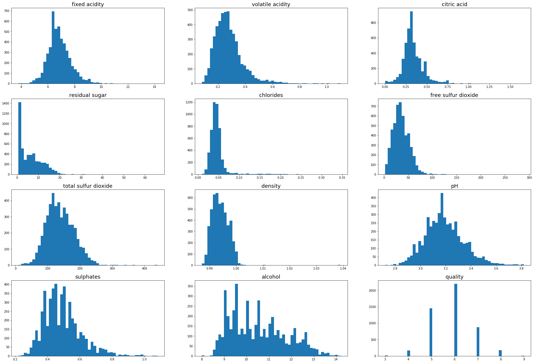
import matplotlib.pyplot as plt

plt.figure(figsize=(32,22))
for i in range(1,white.shape[1]+1):
    plt.subplot(4,3,i)
    plt.hist(white.iloc[:,i-1],bins=50)
    plt.title(white.columns[i-1],fontsize=18)
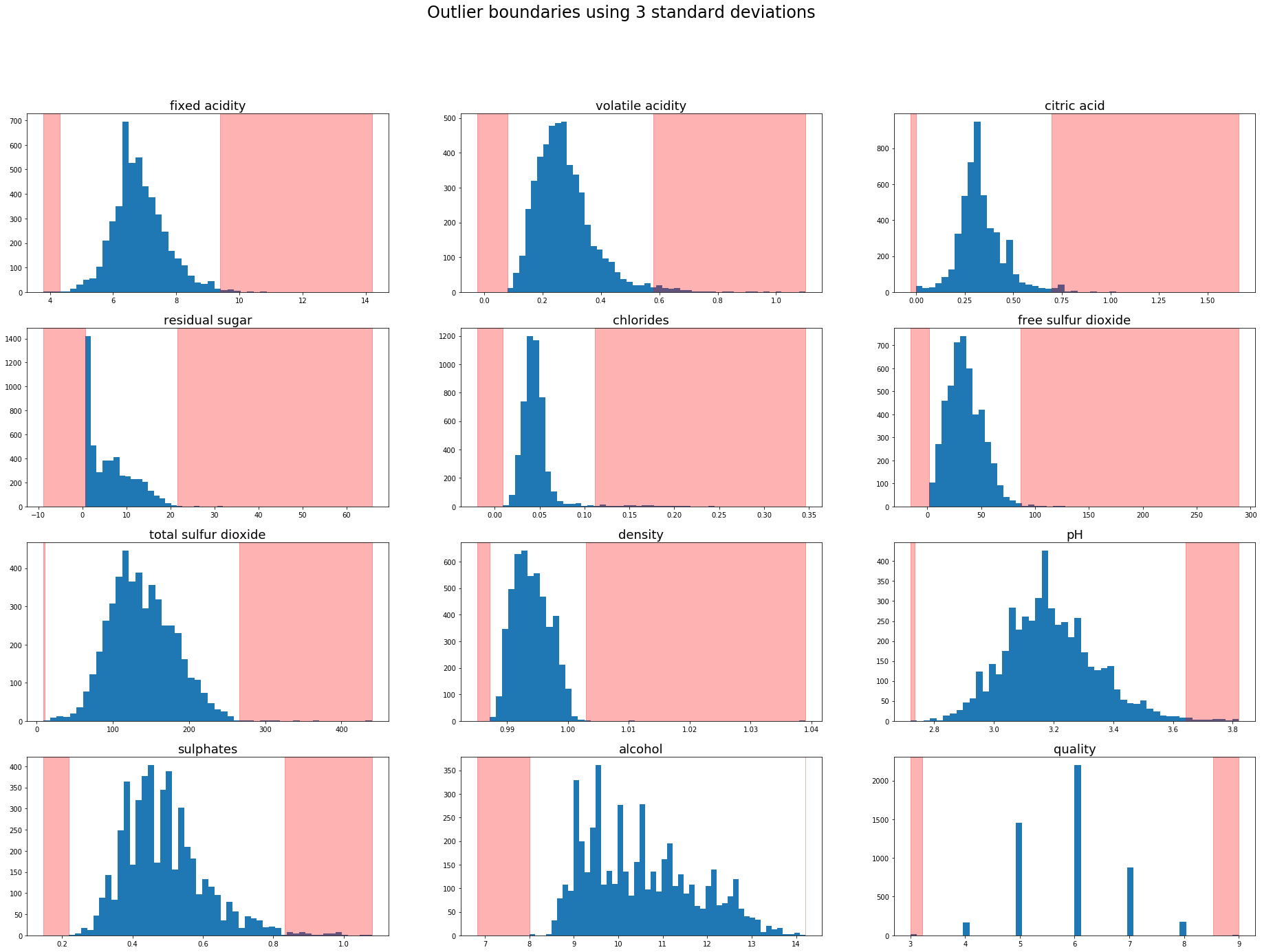
Outlier detection using standard deviation
Using this methodology a sample is treated as an outlier if it is a predefined number of standard deviations from the mean. 3 standard deviations (~99.7%) is common practice for defining outliers but on smaller datasets 2 standard deviations (~95%) could be appropriate.
The outlier boundaries can be visualised by overlaying the outlier region onto the previous charts.
plt.figure(figsize=(32,22))
plt.suptitle('Outlier boundaries using 3 standard deviations',fontsize=24)
for i in range(1,white.shape[1]+1):
    feature = white.iloc[:,i-1]
    mean = feature.mean()
    std_3 = feature.std()*3
    lower, upper = mean-std_3,mean+std_3
    plt.subplot(4,3,i)
    plt.hist(white.iloc[:,i-1],bins=50)
    plt.title(white.columns[i-1],fontsize=18)
    plt.axvspan(feature.min(),lower,color='red',alpha=0.3)
    plt.axvspan(upper,feature.max(),color='red',alpha=0.3)
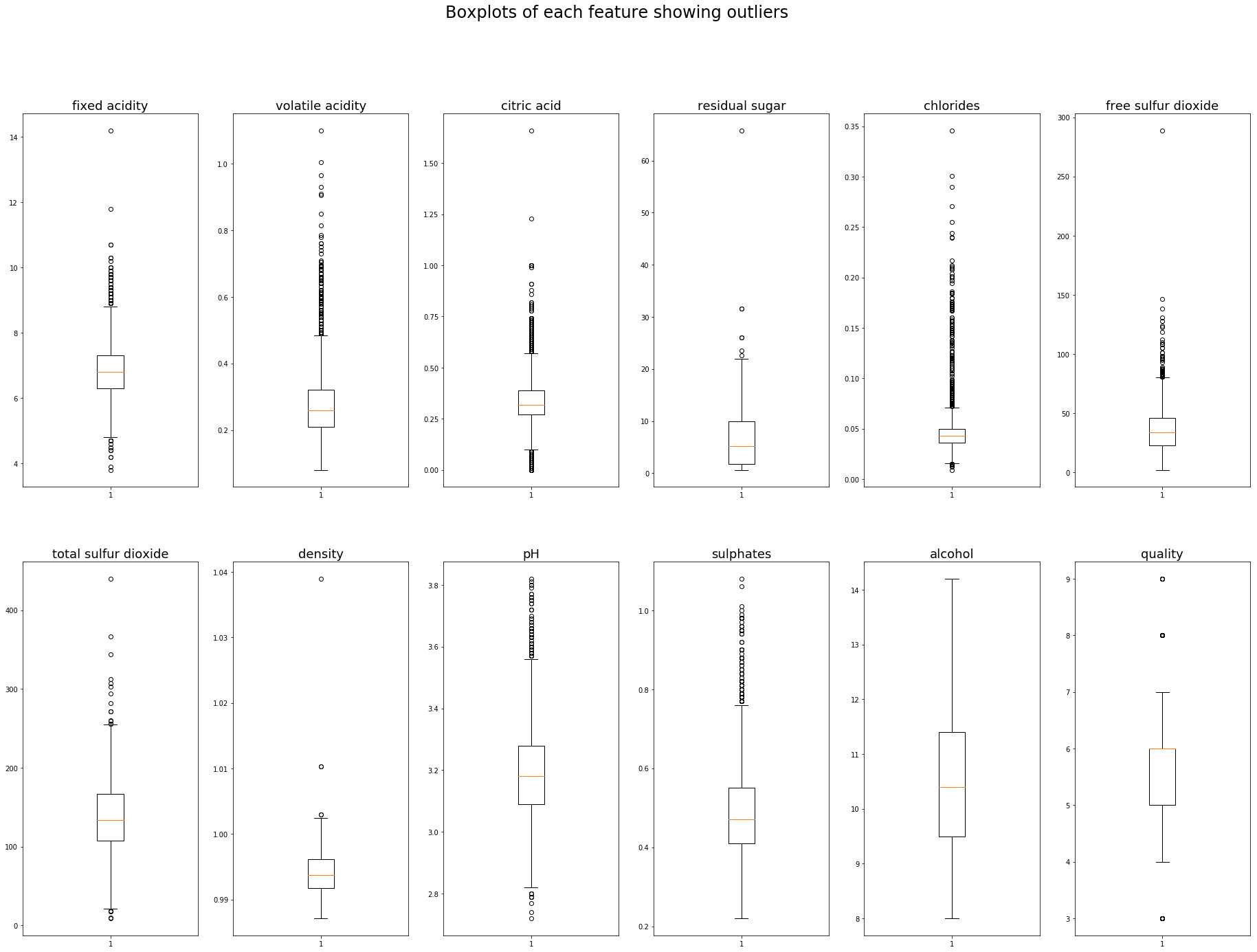
Outlier boundaries using Interquartile range (IQR)
Finding outliers using the IQR is also quite a simple process using python, np.percentile allows us to find the 25th and 75th percentile. The IQR is the difference between the 75th and 25th percentile. A common outlier definition is 1.5 times the IQR below the 25th percentile, and 1.5 times the IQR above the 75th percentile, this could of course be adjusted to a different appropriate multiplier.
A list of the outliers of the ‘pH’ feature could be obtained using the following code:
import numpy as np

p25 = np.percentile(white.pH,25)
p75 = np.percentile(white.pH,75)
iqr = p75 - p25
cutoff = iqr*1.5
lower = p25-cutoff
upper = p75 + cutoff

outliers = [x for x in white.pH if x < lower or x > upper]
print('Lowest 5 outliers : ',sorted(outliers)[:5])
print('Highest 5 outliers : ',sorted(outliers)[-5:])
Lowest 5 outliers :  [2.72, 2.74, 2.77, 2.79, 2.79]
Highest 5 outliers :  [3.79, 3.8, 3.8, 3.81, 3.82]
They could be plotted in any format using the lower and upper boundaries we have just calculated, a boxplot is probably my favourite as it clearly defines the quartiles and outlier boundiares (whiskers). The outliers themselves are plotted as indiviual points beyond the whiskers.
Matplotlib’s boxplot uses 1.5 times the IQR as a default value for it’s whiskers.
plt.figure(figsize=(32,22))
plt.suptitle('Boxplots of each feature showing outliers',fontsize=24)
for i in range(1,white.shape[1]+1):
    plt.subplot(2,6,i)
    plt.boxplot(white.iloc[:,i-1])
    plt.title(white.columns[i-1],fontsize=18)
Outlier detection algorithms
There are a whole host of outlier detection algorithms, for use in detecting both outliers (abnormal observations present in datasets) and novelty detection (detecting if a new observation is an outlier). I will focus on a selection of four algorithms available from the novelty and outlier decetion section of the package sklearn.
LocalOutlierFactor
Computes a score (Local outlier factor) based on the density rating of points around itself compared to the density rating of the k-nearest points. A score similar to that of it’s neighbours indicates an inlier, a score much lower than that of its neighbours indicates an outlier.
OneClassSVM
From Sklearns documentation:
One-class SVM is an unsupervised algorithm that learns a decision function for novelty detection: classifying new data as similar or different to the training set.
Being an unsupervised algorithm it may be especially useful when the true distribution of features is not known.
IsolationForest
Isolation Forest is unsurprisingly a tree based method, selecting a feature at random and splitting on a randomly selected value between the maximum and minimum of that feature. The number of splits required to isolate a sample (path length) averaged over a number of these trees is itself a measure of abnormality. A longer path indicates the sample is similar to others (it was harder to isolate), whereas a short path indicates an easy to isolate sample and therefore an outlier.
EllipticalEnvelope
Working on the assumption that the input data is of a guassian distribution, the elliptical envelope fits an ellipse around the central data points, those outside of the ellipse are the outliers. As dimensions increase so does the shape, two dimensions is an ellipse, three is an ellipsoid (think rugby ball) and so on.
Two dimenisonal visualisation
It is incredibly difficult for humans to visualise data in n-dimensional space, to get an idea of how the different algorithms behave I will run through an example in two dimensions using alcohol and pH.
from sklearn.neighbors import LocalOutlierFactor
from sklearn.svm import OneClassSVM
from sklearn.ensemble import IsolationForest
from sklearn.covariance import EllipticEnvelope

algorithms = [("Local Outlier Factor", LocalOutlierFactor()),
             ("One Class SVM", OneClassSVM()),
             ("Isolation Forest", IsolationForest()),
             ("Elliptical Envelope", EllipticEnvelope()),
              ]
X = pd.DataFrame({'alcohol':white.alcohol,'pH':white.pH})
color = np.array(['blue','red'])
plt.figure(figsize = (22,20))
plot_num = 1
for name, algo in algorithms:
    plt.subplot(2,2,plot_num)
    if name == "Local Outlier Factor":
        pred = algo.fit_predict(X)
    else:
        pred = algo.fit(X).predict(X)
    plt.title(name,fontsize=18)
    plt.xlabel('Alcohol content',fontsize=14)
    plt.ylabel('pH level',fontsize=14)
    plt.scatter(x=white.alcohol,y=white.pH,s=6,color=color[(pred+1)//2])
    plot_num+=1
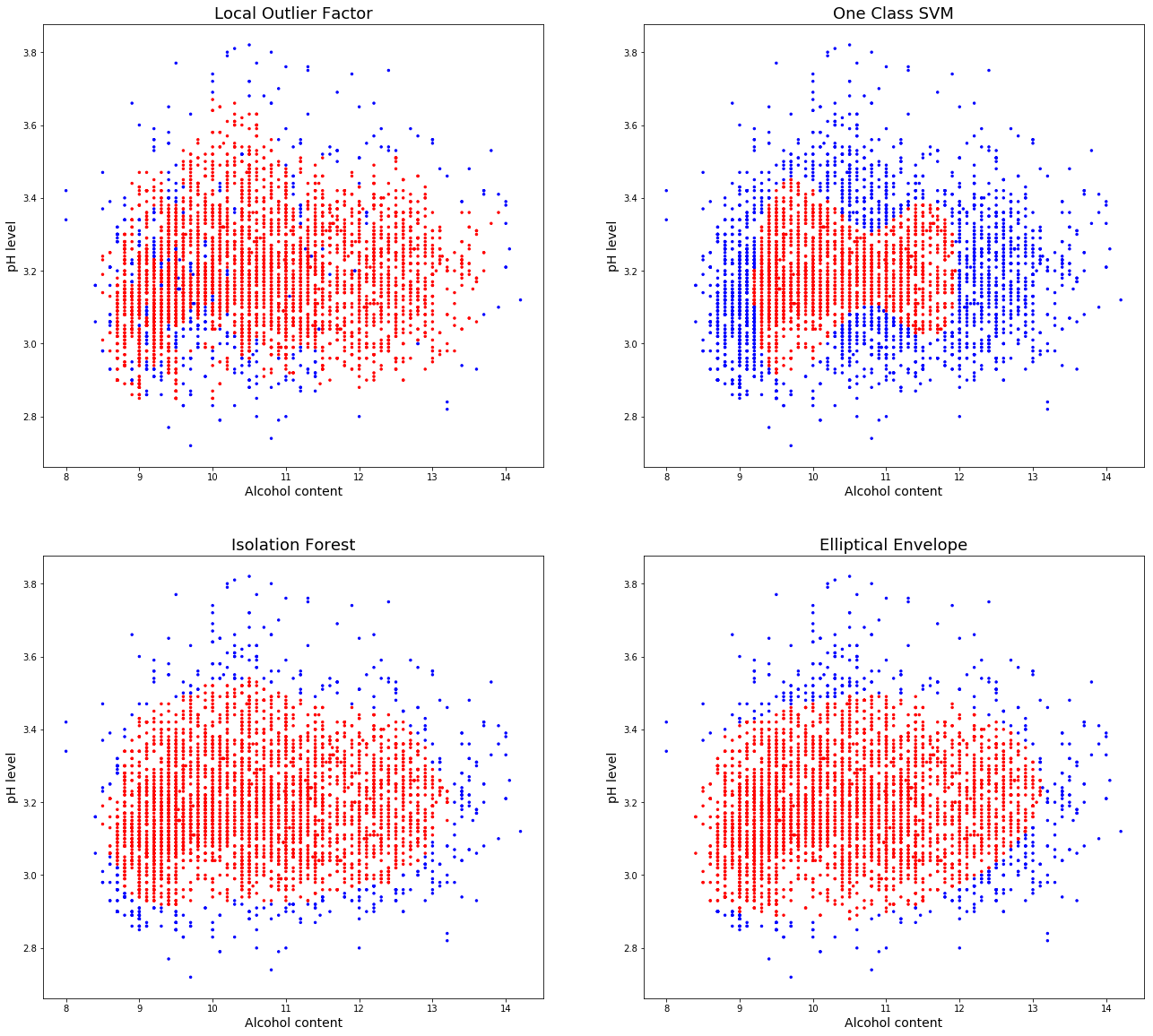
There are some very different results obtained by the default parameters of each of these algorithms. Local outlier factor mis-lablels a lot of non outliers, with many values in a small area, increasing the number of neighbours parameter will help to catch the central mislabeled values, at the expense of also increasing the “capture area”.
The OneClassSVM is overfitting the data, some adjustment would be needed for this simple dataset, however in a higher dimensional space may prove more useful.
Isolation forest does a very good job of capturing the data and the elliptical envelope also obtains similar results.
Test algorithms on white wine dataset
X = white

for name, algo in algorithms:
    if name == "Local Outlier Factor":
        pred = algo.fit_predict(X)
    else:
        pred = algo.fit(X).predict(X)
    outliers = [x for x in pred if x==-1]
    print(name, ':', len(outliers), 'potential outliers detected.')
Local Outlier Factor : 490 potential outliers detected.
One Class SVM : 2440 potential outliers detected.
Isolation Forest : 490 potential outliers detected.
Elliptical Envelope : 490 potential outliers detected.
The results when using the full dataset are very similar to that which we saw in the two dimensional test earlier, with OneClassSVM overfitting and reporting far too many outliers. All of the other algorithms returned the same results.
These potential outliers could then be manually inspected, removed, or subject to another filtering system depending on the objective.
Summary
To conclude, we have looked at different ways to detect and visualise outliers in different dimensional datasets, using standard devations and IQR is a simple method for looking at individual features. When considering many features of a dataset simultaneously there are algorithms that can detect potential outliers for us, each of these algorithms compute outliers in a different manner. OneClassSVM in particular was overfitting our dataset, given the large percentage of outliers reported by the other three algorithms OneClassSVM may be better suited when the ratio of outliers to inliers is much smaller. However the documentation does indicate that as OneClassSVM is sensitive to outliers, it may not be suitable for outlier detection at all.